Chapter 28 Smoothing
Before continuing learning about machine learning algorithms, we introduce the important concept of smoothing. Smoothing is a very powerful technique used all across data analysis. Other names given to this technique are curve fitting and low pass filtering. It is designed to detect trends in the presence of noisy data in cases in which the shape of the trend is unknown. The smoothing name comes from the fact that to accomplish this feat, we assume that the trend is smooth, as in a smooth surface. In contrast, the noise, or deviation from the trend, is unpredictably wobbly:
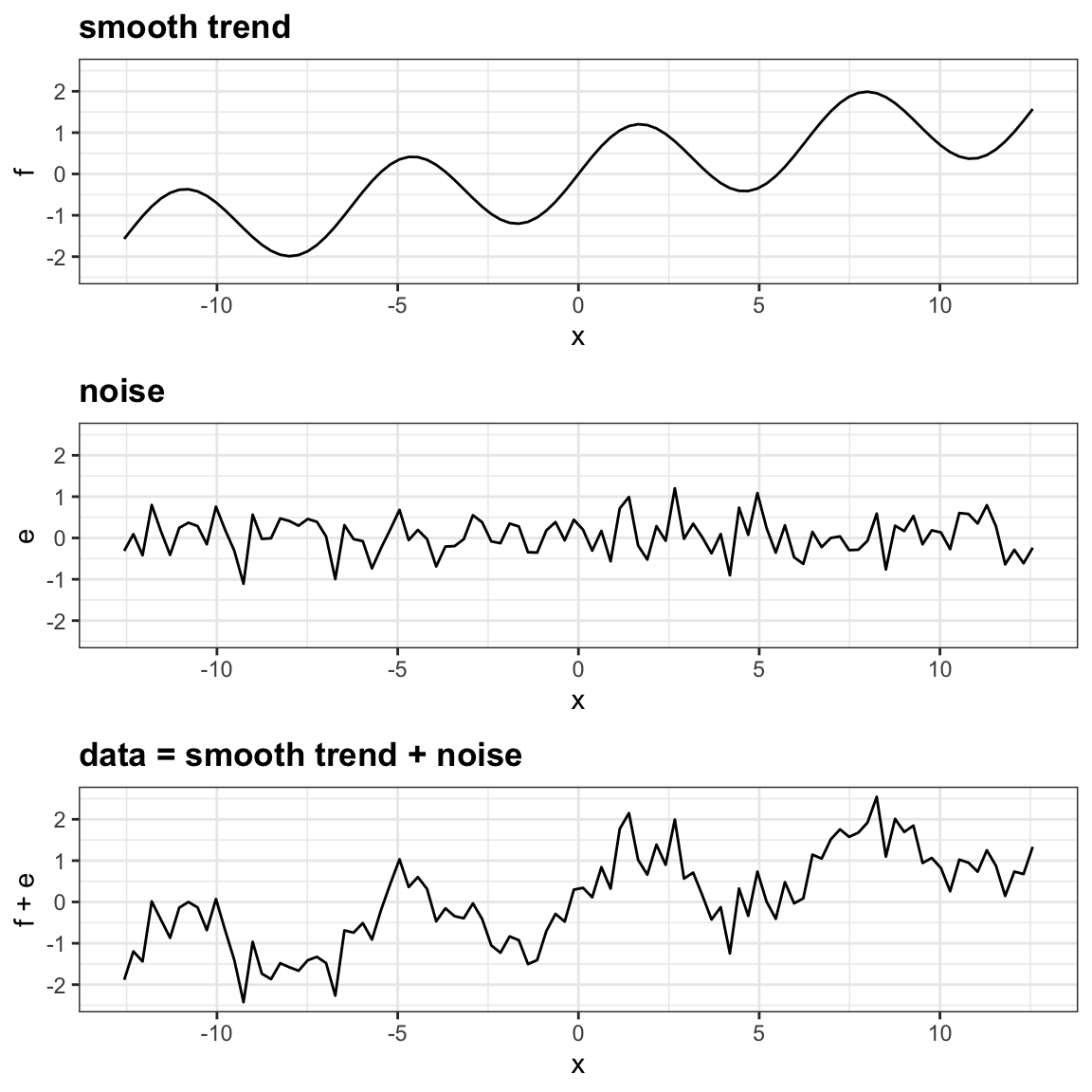
Part of what we explain in this section are the assumptions that permit us to extract the trend from the noise.
To understand why we cover this topic, remember that the concepts behind smoothing techniques are extremely useful in machine learning because conditional expectations/probabilities can be thought of as trends of unknown shapes that we need to estimate in the presence of uncertainty.
To explain these concepts, we will focus first on a problem with just one predictor. Specifically, we try to estimate the time trend in the 2008 US popular vote poll margin (difference between Obama and McCain).
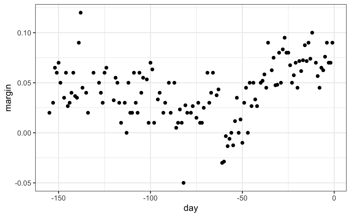
For the purposes of this example, do not think of it as a forecasting problem. Instead, we are simply interested in learning the shape of the trend after the election is over.
We assume that for any given day \(x\), there is a true preference among the electorate \(f(x)\), but due to the uncertainty introduced by the polling, each data point comes with an error \(\varepsilon\). A mathematical model for the observed poll margin \(Y_i\) is:
\[ Y_i = f(x_i) + \varepsilon_i \]
To think of this as a machine learning problem, consider that we want to predict \(Y\) given a day \(x\). If we knew the conditional expectation \(f(x) = \mbox{E}(Y \mid X=x)\), we would use it. But since we don’t know this conditional expectation, we have to estimate it. Let’s use regression, since it is the only method we have learned up to now.
#> `geom_smooth()` using formula = 'y ~ x'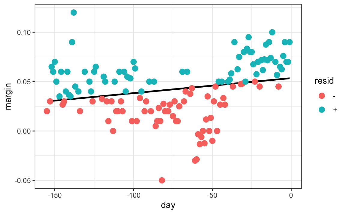
The line we see does not appear to describe the trend very well. For example, on September 4 (day -62), the Republican Convention was held and the data suggest that it gave John McCain a boost in the polls. However, the regression line does not capture this potential trend. To see the lack of fit more clearly, we note that points above the fitted line (blue) and those below (red) are not evenly distributed across days. We therefore need an alternative, more flexible approach.
28.1 Bin smoothing
The general idea of smoothing is to group data points into strata in which the value of \(f(x)\) can be assumed to be constant. We can make this assumption because we think \(f(x)\) changes slowly and, as a result, \(f(x)\) is almost constant in small windows of time. An example of this idea for the poll_2008 data is to assume that public opinion remained approximately the same within a week’s time. With this assumption in place, we have several data points with the same expected value.
If we fix a day to be in the center of our week, call it \(x_0\), then for any other day \(x\) such that \(|x - x_0| \leq 3.5\), we assume \(f(x)\) is a constant \(f(x) = \mu\). This assumption implies that: \[ E[Y_i | X_i = x_i ] \approx \mu \mbox{ if } |x_i - x_0| \leq 3.5 \]
In smoothing, we call the size of the interval satisfying \(|x_i - x_0| \leq 3.5\) the window size, bandwidth or span. Later we will see that we try to optimize this parameter.
This assumption implies that a good estimate for \(f(x)\) is the average of the \(Y_i\) values in the window. If we define \(A_0\) as the set of indexes \(i\) such that \(|x_i - x_0| \leq 3.5\) and \(N_0\) as the number of indexes in \(A_0\), then our estimate is:
\[ \hat{f}(x_0) = \frac{1}{N_0} \sum_{i \in A_0} Y_i \]
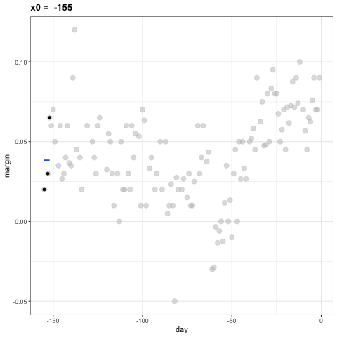
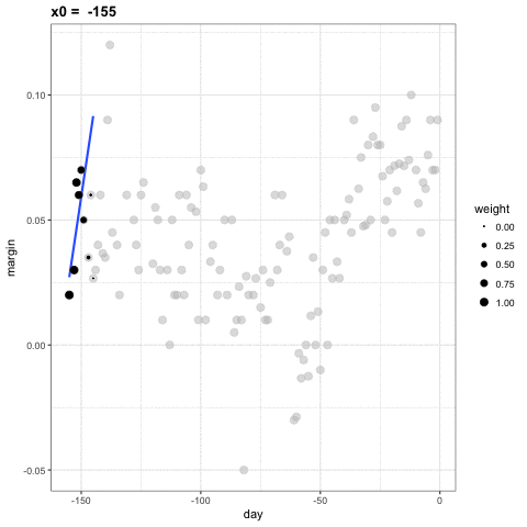
The idea behind bin smoothing is to make this calculation with each value of \(x\) as the center. In the poll example, for each day, we would compute the average of the values within a week with that day in the center. Here are two examples: \(x_0 = -125\) and \(x_0 = -55\). The blue segment represents the resulting average.
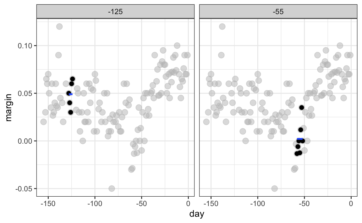
By computing this mean for every point, we form an estimate of the underlying curve \(f(x)\). Below we show the procedure happening as we move from the -155 up to 0. At each value of \(x_0\), we keep the estimate \(\hat{f}(x_0)\) and move on to the next point:
The final code and resulting estimate look like this:
span <- 7
fit <- with(polls_2008,
            ksmooth(day, margin, kernel = "box", bandwidth = span))

polls_2008 |> mutate(smooth = fit$y) |>
  ggplot(aes(day, margin)) +
    geom_point(size = 3, alpha = .5, color = "grey") +
  geom_line(aes(day, smooth), color="red")
28.2 Kernels
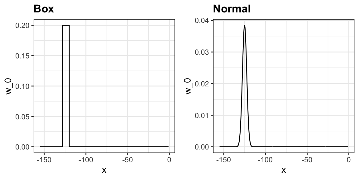
The final result from the bin smoother is quite wiggly. One reason for this is that each time the window moves, two points change. We can attenuate this somewhat by taking weighted averages that give the center point more weight than far away points, with the two points at the edges receiving very little weight.
You can think of the bin smoother approach as a weighted average:
\[ \hat{f}(x_0) = \sum_{i=1}^N w_0(x_i) Y_i \]
in which each point receives a weight of either \(0\) or \(1/N_0\), with \(N_0\) the number of points in the week. In the code above, we used the argument kernel="box" in our call to the function ksmooth. This is because the weight function looks like a box.
The ksmooth function provides a “smoother” option which uses the normal density to assign weights.
The final code and resulting plot for the normal kernel look like this:
span <- 7
fit <- with(polls_2008,
            ksmooth(day, margin, kernel = "normal", bandwidth = span))

polls_2008 |> mutate(smooth = fit$y) |>
  ggplot(aes(day, margin)) +
  geom_point(size = 3, alpha = .5, color = "grey") +
  geom_line(aes(day, smooth), color="red")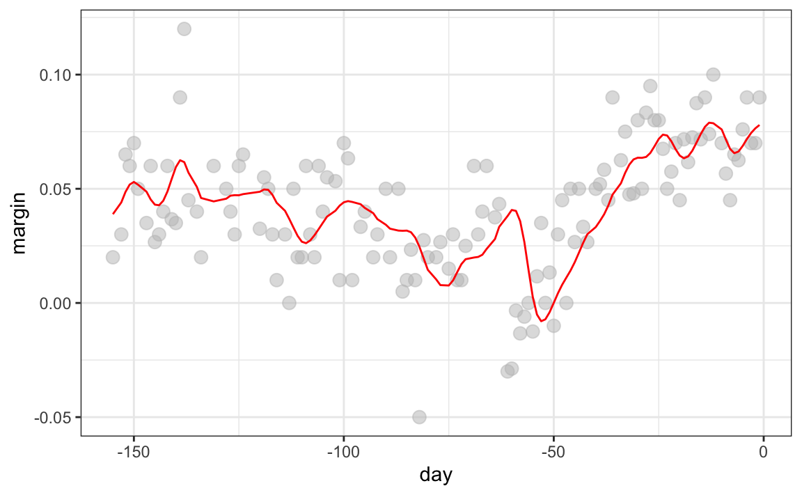
Notice that the final estimate now looks smoother.
There are several functions in R that implement bin smoothers. One example is ksmooth, shown above. In practice, however, we typically prefer methods that use slightly more complex models than fitting a constant. The final result above, for example, is still somewhat wiggly in parts we don’t expect it to be (between -125 and -75, for example). Methods such as loess, which we explain next, improve on this.
28.3 Local weighted regression (loess)
A limitation of the bin smoother approach just described is that we need small windows for the approximately constant assumptions to hold. As a result, we end up with a small number of data points to average and obtain imprecise estimates \(\hat{f}(x)\). Here we describe how local weighted regression (loess) permits us to consider larger window sizes. To do this, we will use a mathematical result, referred to as Taylor’s theorem, which tells us that if you look closely enough at any smooth function \(f(x)\), it will look like a line. To see why this makes sense, consider the curved edges gardeners make using straight-edged spades:

(“Downing Street garden path edge”95 by Flckr user Number 1096. CC-BY 2.0 license97.)
Instead of assuming the function is approximately constant in a window, we assume the function is locally linear. We can consider larger window sizes with the linear assumption than with a constant. Instead of the one-week window, we consider a larger one in which the trend is approximately linear. We start with a three-week window and later consider and evaluate other options:
\[ E[Y_i | X_i = x_i ] = \beta_0 + \beta_1 (x_i-x_0) \mbox{ if } |x_i - x_0| \leq 21 \]
For every point \(x_0\), loess defines a window and fits a line within that window. Here is an example showing the fits for \(x_0=-125\) and \(x_0 = -55\):
#> `geom_smooth()` using formula = 'y ~ x'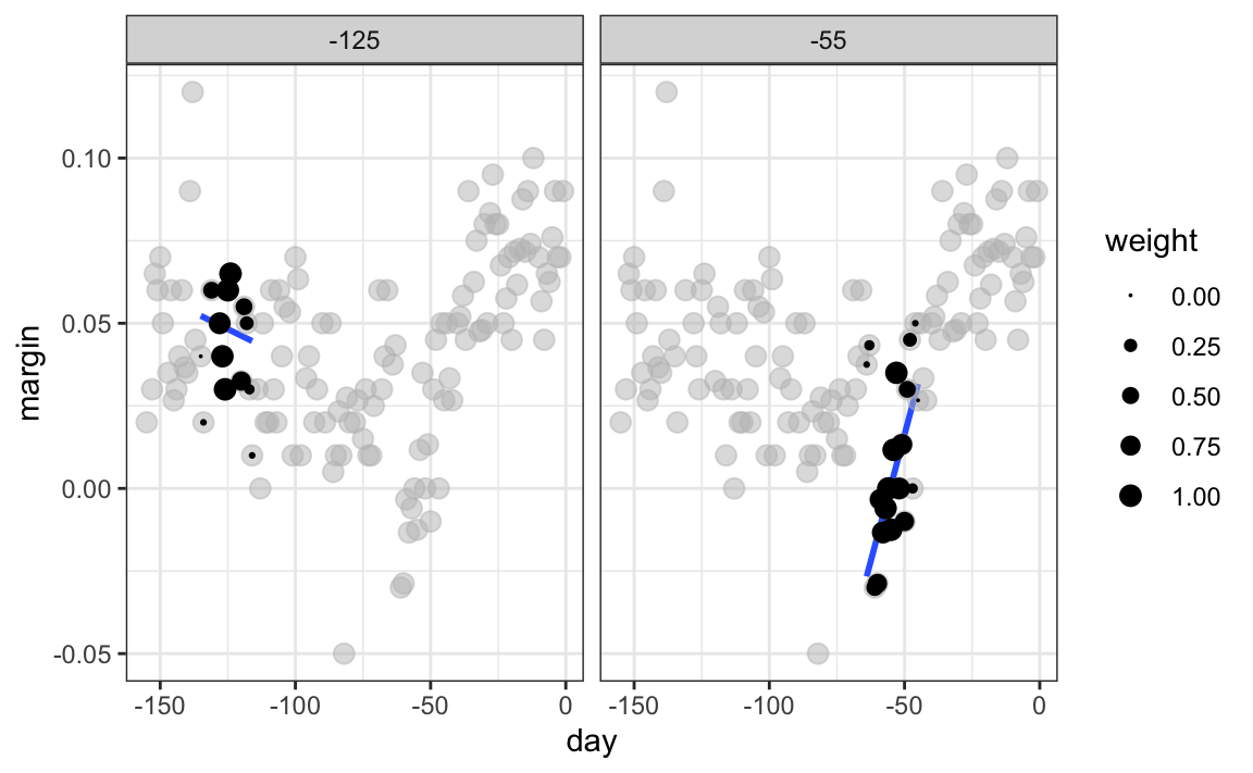
The fitted value at \(x_0\) becomes our estimate \(\hat{f}(x_0)\). Below we show the procedure happening as we move from the -155 up to 0.
The final result is a smoother fit than the bin smoother since we use larger sample sizes to estimate our local parameters:
total_days <- diff(range(polls_2008$day))
span <- 21/total_days

fit <- loess(margin ~ day, degree=1, span = span, data=polls_2008)

polls_2008 |> mutate(smooth = fit$fitted) |>
  ggplot(aes(day, margin)) +
  geom_point(size = 3, alpha = .5, color = "grey") +
  geom_line(aes(day, smooth), color="red")
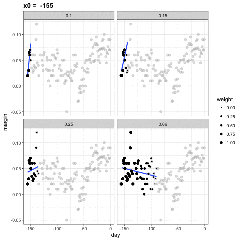
Different spans give us different estimates. We can see how different window sizes lead to different estimates:
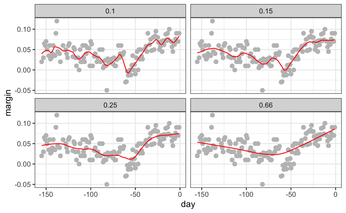
Here are the final estimates:
There are three other differences between loess and the typical bin smoother.
1. Rather than keeping the bin size the same, loess keeps the number of points used in the local fit the same. This number is controlled via the span argument, which expects a proportion. For example, if N is the number of data points and span=0.5, then for a given \(x\), loess will use the 0.5 * N closest points to \(x\) for the fit.
2. When fitting a line locally, loess uses a weighted approach. Basically, instead of using least squares, we minimize a weighted version:
\[ \sum_{i=1}^N w_0(x_i) \left[Y_i - \left\{\beta_0 + \beta_1 (x_i-x_0)\right\}\right]^2 \]
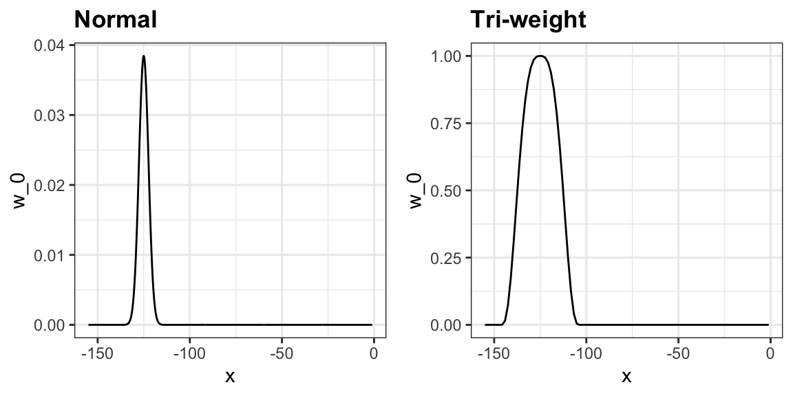
However, instead of the Gaussian kernel, loess uses a function called the Tukey tri-weight:
\[ W(u)= \left( 1 - |u|^3\right)^3 \mbox{ if } |u| \leq 1 \mbox{ and } W(u) = 0 \mbox{ if } |u| > 1 \]
To define the weights, we denote \(2h\) as the window size and define:
\[ w_0(x_i) = W\left(\frac{x_i - x_0}{h}\right) \]
This kernel differs from the Gaussian kernel in that more points get values closer to the max:
3. loess has the option of fitting the local model robustly. An iterative algorithm is implemented in which, after fitting a model in one iteration, outliers are detected and down-weighted for the next iteration. To use this option, we use the argument family="symmetric".
28.3.1 Fitting parabolas
Taylor’s theorem also tells us that if you look at any mathematical function closely enough, it looks like a parabola. The theorem also states that you don’t have to look as closely when approximating with parabolas as you do when approximating with lines. This means we can make our windows even larger and fit parabolas instead of lines.
\[ E[Y_i | X_i = x_i ] = \beta_0 + \beta_1 (x_i-x_0) + \beta_2 (x_i-x_0)^2 \mbox{ if } |x_i - x_0| \leq h \]
This is actually the default procedure of the function loess. You may have noticed that when we showed the code for using loess, we set degree = 1. This tells loess to fit polynomials of degree 1, a fancy name for lines. If you read the help page for loess, you will see that the argument degree defaults to 2. By default, loess fits parabolas not lines. Here is a comparison of the fitting lines (red dashed) and fitting parabolas (orange solid):
total_days <- diff(range(polls_2008$day))
span <- 28/total_days
fit_1 <- loess(margin ~ day, degree=1, span = span, data=polls_2008)

fit_2 <- loess(margin ~ day, span = span, data=polls_2008)


polls_2008 |> mutate(smooth_1 = fit_1$fitted, smooth_2 = fit_2$fitted) |>
  ggplot(aes(day, margin)) +
  geom_point(size = 3, alpha = .5, color = "grey") +
  geom_line(aes(day, smooth_1), color="red", lty = 2) +
geom_line(aes(day, smooth_2), color="orange", lty = 1) 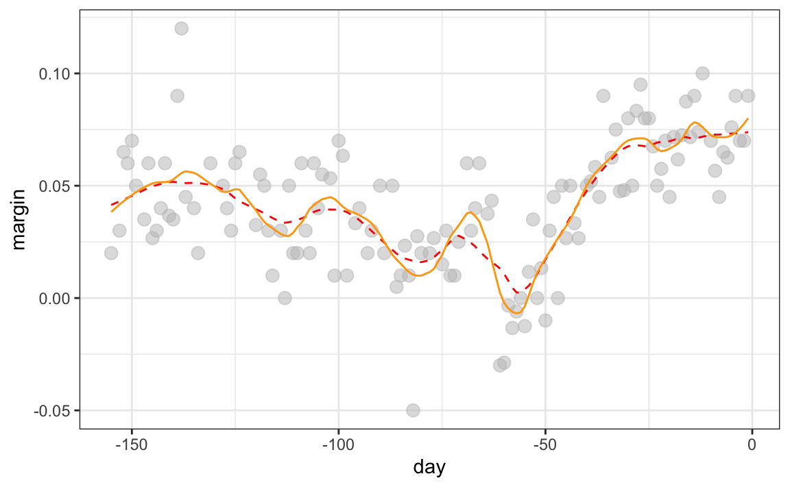
The degree = 2 gives us more wiggly results. We actually prefer degree = 1 as it is less prone to this kind of noise.
28.3.2 Beware of default smoothing parameters
ggplot uses loess in its geom_smooth function:
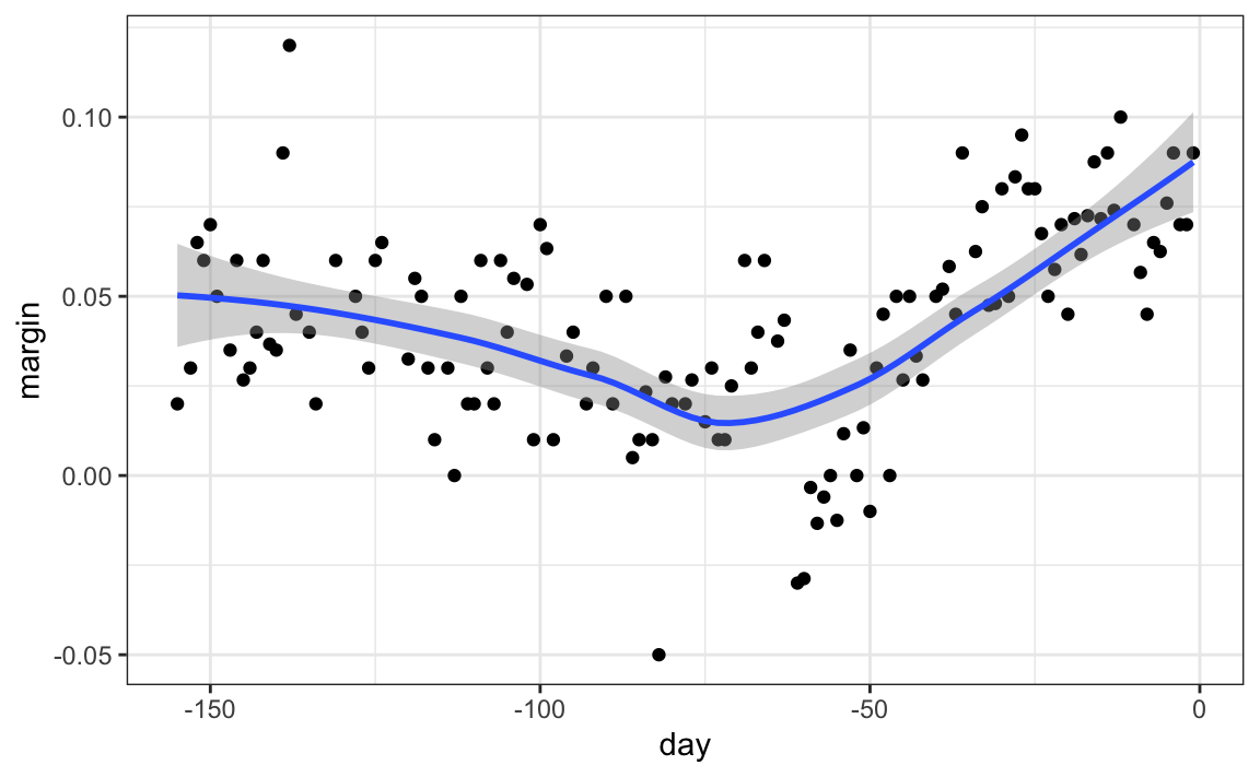
But be careful with default parameters as they are rarely optimal. However, you can conveniently change them:
polls_2008 |> ggplot(aes(day, margin)) +
  geom_point() +
  geom_smooth(method = loess, method.args = list(span = 0.15, degree = 1))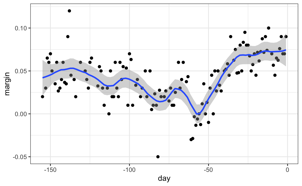
28.4 Connecting smoothing to machine learning
To see how smoothing relates to machine learning with a concrete example, consider our 27.8 example. If we define the outcome \(Y = 1\) for digits that are seven and \(Y=0\) for digits that are 2, then we are interested in estimating the conditional probability:
\[ p(x_1, x_2) = \mbox{Pr}(Y=1 \mid X_1=x_1 , X_2 = x_2). \] with \(X_1\) and \(X_2\) the two predictors defined in Section 27.8. In this example, the 0s and 1s we observe are “noisy” because for some regions the probabilities \(p(x_1, x_2)\) are not that close to 0 or 1. So we need to estimate \(p(x_1, x_2)\). Smoothing is an alternative to accomplishing this. In Section 27.8 we saw that linear regression was not flexible enough to capture the non-linear nature of \(p(x_1, x_2)\), thus smoothing approaches may provide an improvement. In the next chapter we describe a popular machine learning algorithm, k-nearest neighbors, which is based on bin smoothing.
28.5 Exercises
1. In the wrangling part of this book, we used the code below to obtain mortality counts for Puerto Rico for 2015-2018.
library(tidyverse)
library(lubridate)
library(purrr)
library(pdftools)
library(dslabs)

fn <- system.file("extdata", "RD-Mortality-Report_2015-18-180531.pdf",
                  package="dslabs")
dat <- map_df(str_split(pdf_text(fn), "\n"), function(s){
  s <- str_trim(s)
  header_index <- str_which(s, "2015")[1]
  tmp <- str_split(s[header_index], "\\s+", simplify = TRUE)
  month <- tmp[1]
  header <- tmp[-1]
  tail_index  <- str_which(s, "Total")
  n <- str_count(s, "\\d+")
  out <- c(1:header_index, which(n == 1),
           which(n >= 28), tail_index:length(s))
  s <- s[-out] |>  str_remove_all("[^\\d\\s]") |> str_trim() |>
    str_split_fixed("\\s+", n = 6)
  s[,1:5] |> as_tibble() |>
    setNames(c("day", header)) |>
    mutate(month = month, day = as.numeric(day)) |>
    pivot_longer(-c(day, month), names_to = "year", values_to = "deaths") |>
    mutate(deaths = as.numeric(deaths))
}) |>
  mutate(month = recode(month,
                        "JAN" = 1, "FEB" = 2, "MAR" = 3,
                        "APR" = 4, "MAY" = 5, "JUN" = 6,
                        "JUL" = 7, "AGO" = 8, "SEP" = 9,
                        "OCT" = 10, "NOV" = 11, "DEC" = 12)) |>
  mutate(date = make_date(year, month, day)) |>
  filter(date <= "2018-05-01")
Use the loess function to obtain a smooth estimate of the expected number of deaths as a function of date. Plot this resulting smooth function. Make the span about two months long.
2. Plot the smooth estimates against day of the year, all on the same plot but with different colors.
3. Suppose we want to predict 2s and 7s in our mnist_27 dataset with just the second covariate. Can we do this? On first inspection it appears the data does not have much predictive power. In fact, if we fit a regular logistic regression, the coefficient for x_2 is not significant!
library(broom)
library(dslabs)
data("mnist_27")
mnist_27$train |>
  glm(y ~ x_2, family = "binomial", data = _) |>
  tidy()
Plotting a scatterplot here is not useful since y is binary:
Fit a loess line to the data above and plot the results. Notice that there is predictive power, except the conditional probability is not linear.