Chapter 12 Robust summaries
12.1 Outliers
We previously described how boxplots show outliers, but we did not provide a precise definition. Here we discuss outliers, approaches that can help detect them, and summaries that take into account their presence.
Outliers are very common in data science. Data recording can be complex and it is common to observe data points generated in error. For example, an old monitoring device may read out nonsensical measurements before completely failing. Human error is also a source of outliers, in particular when data entry is done manually. An individual, for instance, may mistakenly enter their height in centimeters instead of inches or put the decimal in the wrong place.
How do we distinguish an outlier from measurements that were too big or too small simply due to expected variability? This is not always an easy question to answer, but we try to provide some guidance. Let’s begin with a simple case.
Suppose a colleague is charged with collecting demography data for a group of males. The data report height in feet and are stored in the object:
library(tidyverse)
library(dslabs)
data(outlier_example)
str(outlier_example)
#>  num [1:500] 5.59 5.8 5.54 6.15 5.83 5.54 5.87 5.93 5.89 5.67 ...
Our colleague uses the fact that heights are usually well approximated by a normal distribution and summarizes the data with average and standard deviation:
mean(outlier_example)
#> [1] 6.1
sd(outlier_example)
#> [1] 7.8
and writes a report on the interesting fact that this group of males is much taller than usual. The average height is over six feet tall! Using your data science skills, however, you notice something else that is unexpected: the standard deviation is over 7 feet. Adding and subtracting two standard deviations, you note that 95% of this population will have heights between -9.489, 21.697 feet, which does not make sense. A quick plot reveals the problem:
boxplot(outlier_example)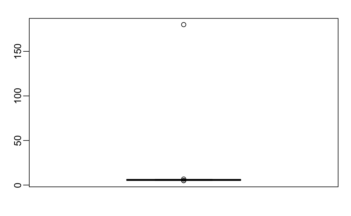
There appears to be at least one value that is nonsensical, since we know that a height of 180 feet is impossible. The boxplot detects this point as an outlier.
12.2 Median
When we have an outlier like this, the average can become very large. Mathematically, we can make the average as large as we want by simply changing one number: with 500 data points, we can increase the average by any amount \(\Delta\) by adding \(\Delta \times\) 500 to a single number. The median, defined as the value for which half the values are smaller and the other half are bigger, is robust to such outliers. No matter how large we make the largest point, the median remains the same.
With this data the median is:
median(outlier_example)
#> [1] 5.74
which is about 5 feet and 9 inches.
The median is what boxplots display as a horizontal line.
12.3 The inter quartile range (IQR)
The box in boxplots is defined by the first and third quartile. These are meant to provide an idea of the variability in the data: 50% of the data is within this range. The difference between the 3rd and 1st quartile (or 75th and 25th percentiles) is referred to as the inter quartile range (IQR). As is the case with the median, this quantity will be robust to outliers as large values do not affect it. We can do some math to see that for normally distributed data, the IQR / 1.349 approximates the standard deviation of the data had an outlier not been present. We can see that this works well in our example since we get a standard deviation estimate of:
IQR(outlier_example) / 1.349
#> [1] 0.245
which is about 3 inches.
12.4 Tukey’s definition of an outlier
In R, points falling outside the whiskers of the boxplot are referred to as outliers. This definition of outlier was introduced by Tukey. The top whisker ends at the 75th percentile plus 1.5 \(\times\) IQR. Similarly the bottom whisker ends at the 25th percentile minus 1.5\(\times\) IQR. If we define the first and third quartiles as \(Q_1\) and \(Q_3\), respectively, then an outlier is anything outside the range:
\[[Q_1 - 1.5 \times (Q_3 - Q1), Q_3 + 1.5 \times (Q_3 - Q1)].\]
When the data is normally distributed, the standard units of these values are:
q3 <- qnorm(0.75)
q1 <- qnorm(0.25)
iqr <- q3 - q1
r <- c(q1 - 1.5*iqr, q3 + 1.5*iqr)
r
#> [1] -2.7  2.7
Using the pnorm function, we see that 99.3% of the data falls in this interval.
Keep in mind that this is not such an extreme event: if we have 1000 data points that are normally distributed, we expect to see about 7 outside of this range. But these would not be outliers since we expect to see them under the typical variation.
If we want an outlier to be rarer, we can increase the 1.5 to a larger number. Tukey also used 3 and called these far out outliers. With a normal distribution,
100%
of the data falls in this interval. This translates into about 2 in a million chance of being outside the range. In the geom_boxplot function, this can be controlled by the outlier.size argument, which defaults to 1.5.
The 180 inches measurement is well beyond the range of the height data:
max_height <- quantile(outlier_example, 0.75) + 3*IQR(outlier_example)
max_height
#>  75%
#> 6.91
If we take this value out, we can see that the data is in fact normally distributed as expected:
x <- outlier_example[outlier_example < max_height]
qqnorm(x)
qqline(x)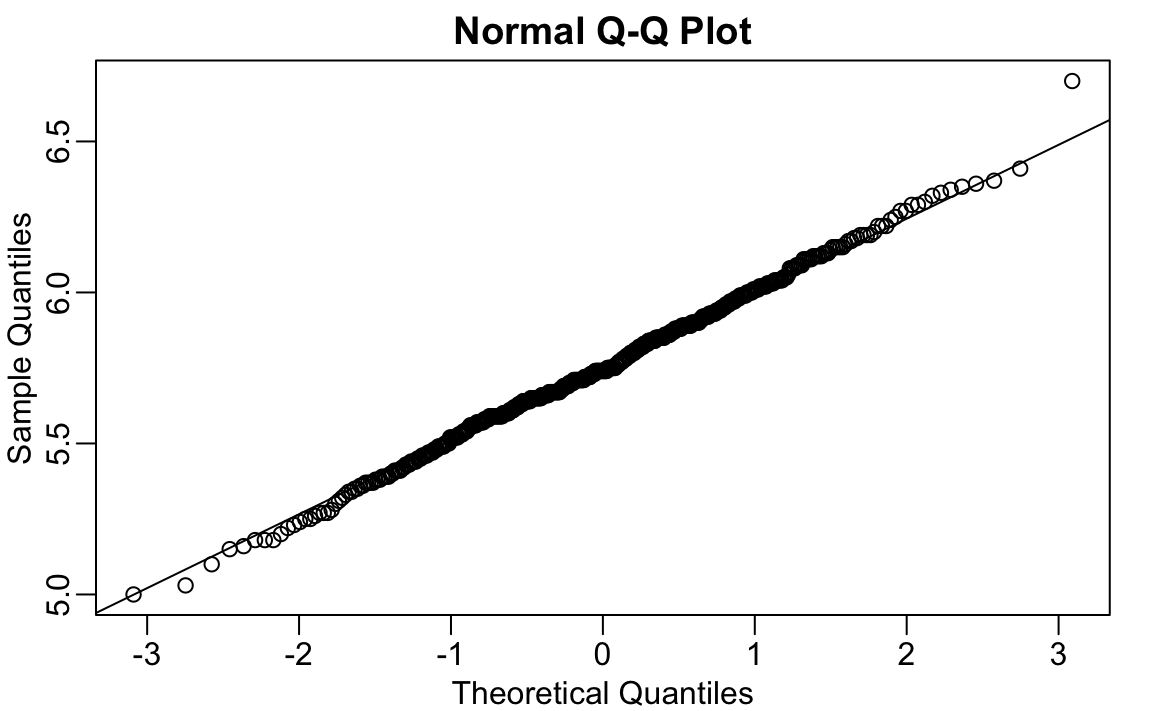
12.5 Median absolute deviation
Another way to robustly estimate the standard deviation in the presence of outliers is to use the median absolute deviation (MAD). To compute the MAD, we first compute the median, and then for each value we compute the distance between that value and the median. The MAD is defined as the median of these distances. For technical reasons not discussed here, this quantity needs to be multiplied by 1.4826 to assure it approximates the actual standard deviation. The mad function already incorporates this correction. For the height data, we get a MAD of:
mad(outlier_example)
#> [1] 0.237
which is about 3 inches.
12.6 Exercises
We are going to use the HistData package. If it is not installed you can install it like this:
install.packages("HistData")Load the height data set and create a vector x with just the male heights used in Galton’s data on the heights of parents and their children from his historic research on heredity.
library(HistData)
data(Galton)
x <- Galton$child
1. Compute the average and median of these data.
2. Compute the median and median absolute deviation of these data.
3. Now suppose Galton made a mistake when entering the first value and forgot to use the decimal point. You can imitate this error by typing:
x_with_error <- x
x_with_error[1] <- x_with_error[1]*10
How many inches does the average grow after this mistake?
4. How many inches does the SD grow after this mistake?
5. How many inches does the median grow after this mistake?
6. How many inches does the MAD grow after this mistake?
7. How could you use exploratory data analysis to detect that an error was made?
- Since it is only one value out of many, we will not be able to detect this.
- We would see an obvious shift in the distribution.
- A boxplot, histogram, or qq-plot would reveal a clear outlier.
- A scatterplot would show high levels of measurement error.
8. How much can the average accidentally grow with mistakes like this? Write a function called error_avg that takes a value k and returns the average of the vector x after the first entry changed to k. Show the results for k=10000 and k=-10000.
12.7 Case study: self-reported student heights
The heights we have been looking at are not the original heights reported by students. The original reported heights are also included in the dslabs package and can be loaded like this:
library(dslabs)
data("reported_heights")
Height is a character vector so we create a new column with the numeric version:
reported_heights <- reported_heights %>%
  mutate(original_heights = height, height = as.numeric(height))
#> Warning in mask$eval_all_mutate(quo): NAs introduced by coercion
Note that we get a warning about NAs. This is because some of the self reported heights were not numbers. We can see why we get these:
reported_heights %>% filter(is.na(height)) %>%  head()
#>            time_stamp    sex height original_heights
#> 1 2014-09-02 15:16:28   Male     NA            5' 4"
#> 2 2014-09-02 15:16:37 Female     NA            165cm
#> 3 2014-09-02 15:16:52   Male     NA              5'7
#> 4 2014-09-02 15:16:56   Male     NA            >9000
#> 5 2014-09-02 15:16:56   Male     NA             5'7"
#> 6 2014-09-02 15:17:09 Female     NA             5'3"
Some students self-reported their heights using feet and inches rather than just inches. Others used centimeters and others were just trolling. For now we will remove these entries:
reported_heights <- filter(reported_heights, !is.na(height))If we compute the average and standard deviation, we notice that we obtain strange results. The average and standard deviation are different from the median and MAD:
reported_heights %>%
  group_by(sex) %>%
  summarize(average = mean(height), sd = sd(height),
            median = median(height), MAD = mad(height))
#> # A tibble: 2 × 5
#>   sex    average    sd median   MAD
#>   <chr>    <dbl> <dbl>  <dbl> <dbl>
#> 1 Female    63.4  27.9   64.2  4.05
#> 2 Male     103.  530.    70    4.45
This suggests that we have outliers, which is confirmed by creating a boxplot:
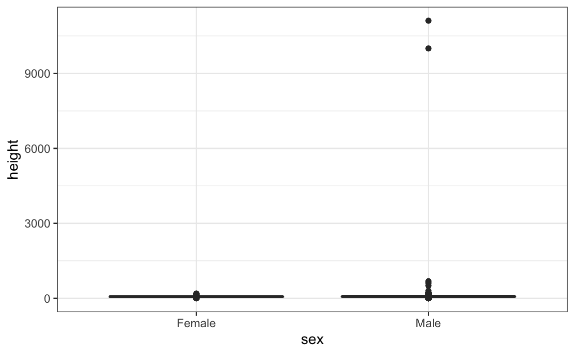
We can see some rather extreme values. To see what these values are, we can quickly look at the largest values using the arrange function:
reported_heights %>% arrange(desc(height)) %>% top_n(10, height)
#>             time_stamp    sex height original_heights
#> 1  2014-09-03 23:55:37   Male  11111            11111
#> 2  2016-04-10 22:45:49   Male  10000            10000
#> 3  2015-08-10 03:10:01   Male    684              684
#> 4  2015-02-27 18:05:06   Male    612              612
#> 5  2014-09-02 15:16:41   Male    511              511
#> 6  2014-09-07 20:53:43   Male    300              300
#> 7  2014-11-28 12:18:40   Male    214              214
#> 8  2017-04-03 16:16:57   Male    210              210
#> 9  2015-11-24 10:39:45   Male    192              192
#> 10 2014-12-26 10:00:12   Male    190              190
#> 11 2016-11-06 10:21:02 Female    190              190
The first seven entries look like strange errors. However, the next few look like they were entered as centimeters instead of inches. Since 184 cm is equivalent to six feet tall, we suspect that 184 was actually meant to be 72 inches.
We can review all the nonsensical answers by looking at the data considered to be far out by Tukey:
whisker <- 3*IQR(reported_heights$height)
max_height <- quantile(reported_heights$height, .75) + whisker
min_height <- quantile(reported_heights$height, .25) - whisker
reported_heights %>%
  filter(!between(height, min_height, max_height)) %>%
  select(original_heights) %>%
  head(n=10) %>% pull(original_heights)
#>  [1] "6"     "5.3"   "511"   "6"     "2"     "5.25"  "5.5"   "11111"
#>  [9] "6"     "6.5"
Examining these heights carefully, we see two common mistakes: entries in centimeters, which turn out to be too large, and entries of the form x.y with x and y representing feet and inches, respectively, which turn out to be too small. Some of the even smaller values, such as 1.6, could be entries in meters.
In the Data Wrangling part of this book we will learn techniques for correcting these values and converting them into inches. Here we were able to detect this problem using careful data exploration to uncover issues with the data: the first step in the great majority of data science projects.